


Dating Pro: More about the Responsive Design Theme
We have spent quite a while working on the responsive theme for the Dating Pro software. Today I would like to describe to you the way navigation works in the new theme, and how you can adjust it to match your brand colours.
Let’s start with the navigation.
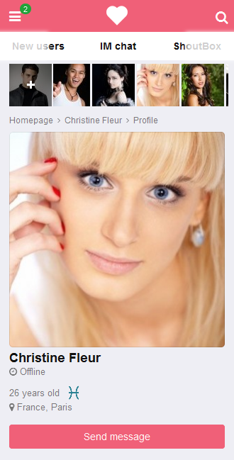
The main menu — everything that has to do with the search options, site activities and communication — opens in the panel that slides out from the left side when you click the hamburger icon on the top left. When you no longer need it, you can hide the menu panel.
This panel shows how much money a user has on his/her internal account with the site and includes a one-click way to go to the replenish account page.
The left menu also shows whether a person has any active and running paid services on the site.
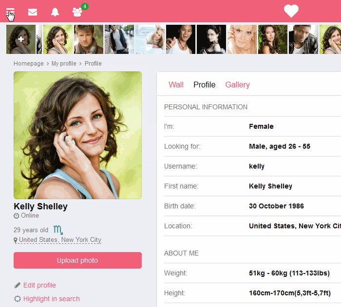
There is another menu in the desktop version that deals with user’s personal account and settings, user’s profile and the home page. It holds a customary position on the right-hand side of the site interface. All these menu items are repeated in the left menu so there is never any trouble accessing different site sections.
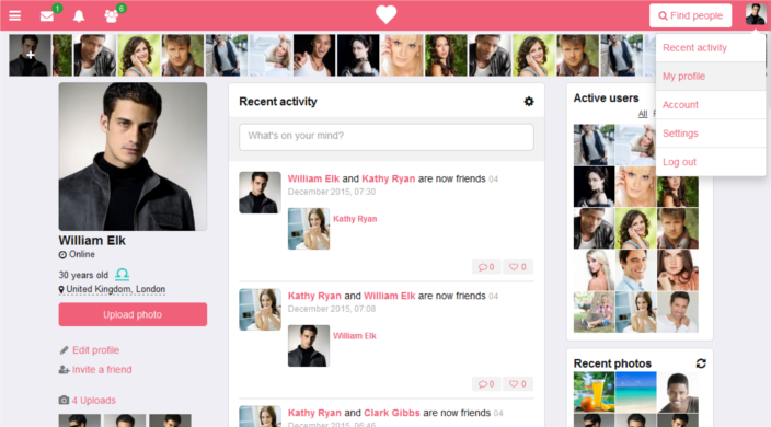
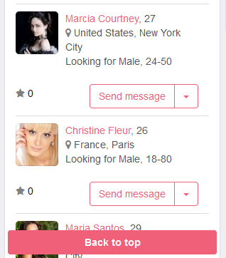
On smaller viewports, the right-hand menu disappears to be replaced with the search button. Settings, account, and logout option are accessible through the left-hand menu.
When one visits a dating website on a mobile device, scrolling may be tiresome. We have introduced the contextual menu on top of the pages that collects headers from all the blocks on any given page and lets you scroll through to the selected block in a fast and easy way. The menu is a slider that you can drag and tap on with a mouse or a finger.
When you start scrolling down, the header hides to give room to the content. When you start scrolling back up, it appears again along with the ‘Back to top’ button that lets you get to the top of the page in just one click.
We hope to have made the navigation easy to use. Any comments and improvement ideas will be appreciated.
Now, let’s talk about the colour scheme.
The colours that we use in the Flatty theme are combined in the admin panel under Interface > Themes > Flatty colour schemes > Edit default colour scheme.
Here you have access to the fonts editor and can manage font family, title size, etc. There is an assortment of bright vs dull colours that you can adjust to your preferred colour scheme thus creating a new look for your website.
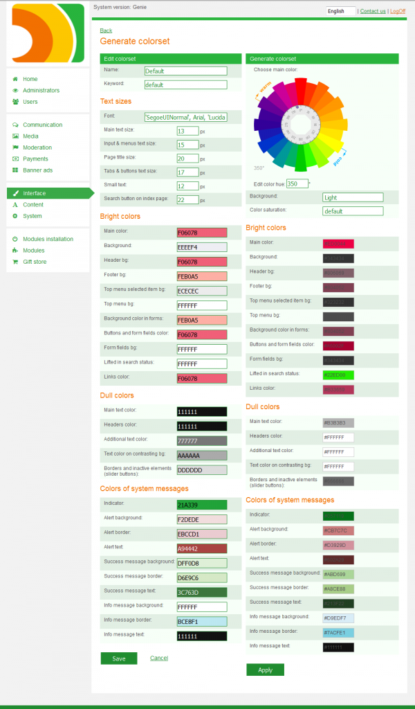
If you are not sure as to what colours to use, check the gallery of web-friendly colours on services like Color Schemer and others.
As always, we are happy to hear your thoughts and comments. Send us your improvement ideas as well, directly via live chat (bottom right corner)!
 (No Ratings Yet)
 Loading...