


Evolution of Dating Pro Profile Page Design
Not long ago we collected screenshots of how the main pages of Dating Pro sites changed over the years – check out this Facebook album. Today we would like to discuss the evolution of Dating Pro’s personal profile pages.
You will see how a site member’s profile followed the major design trends, and will get a peek into the upcoming overhaul.
The ‘liquid’ layout dating back just 5-6 years may remind us of today’s adaptive websites, however it could only squeeze up to a certain point. After that you were supposed to use the horizontal scrollbar.
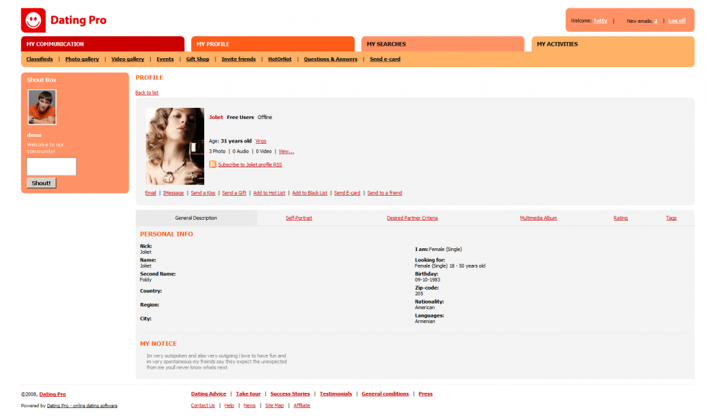
Next came the rectangular-shaped era of what we internally like to call metro-style. All elements had a fixed position on the page regardless of its width.
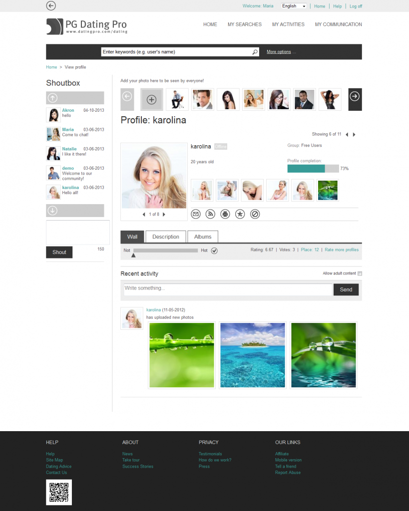
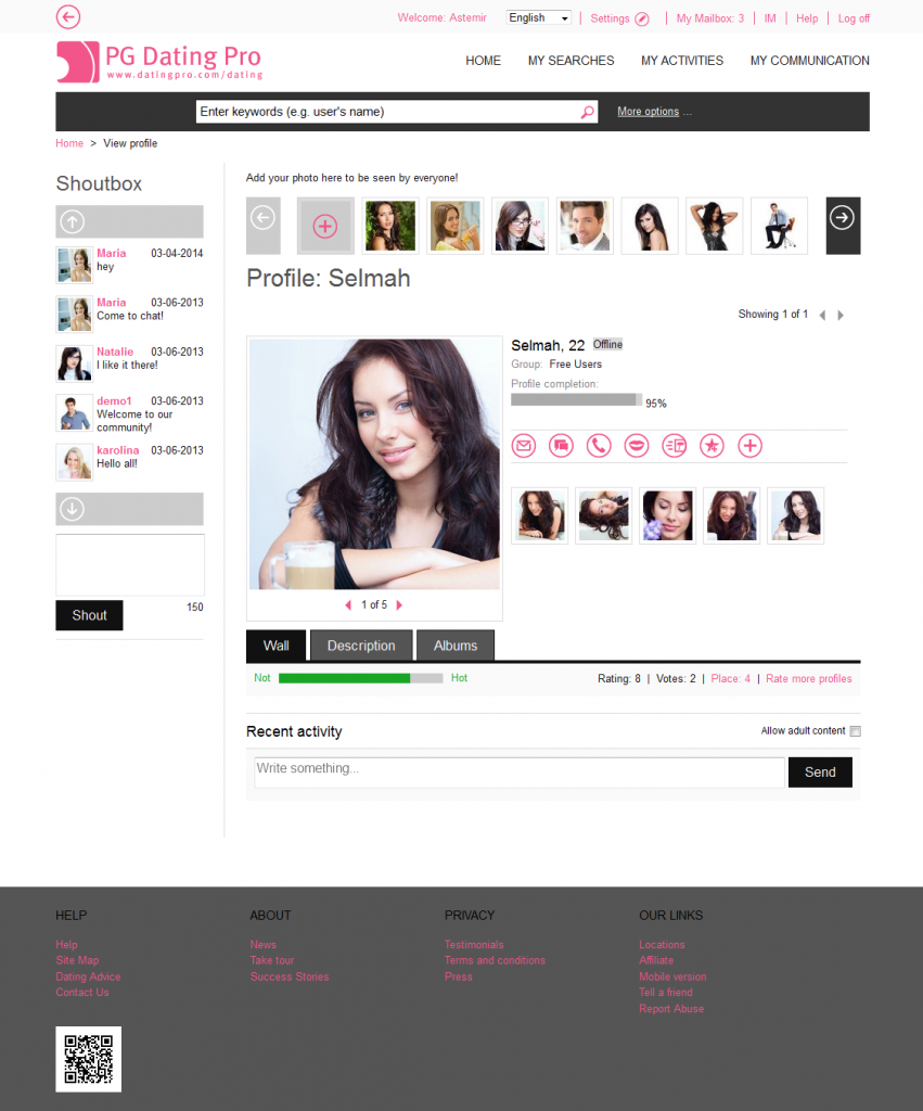
When we switched to the new platform back in 2013, we decided to keep that same look because it was clean and neat.
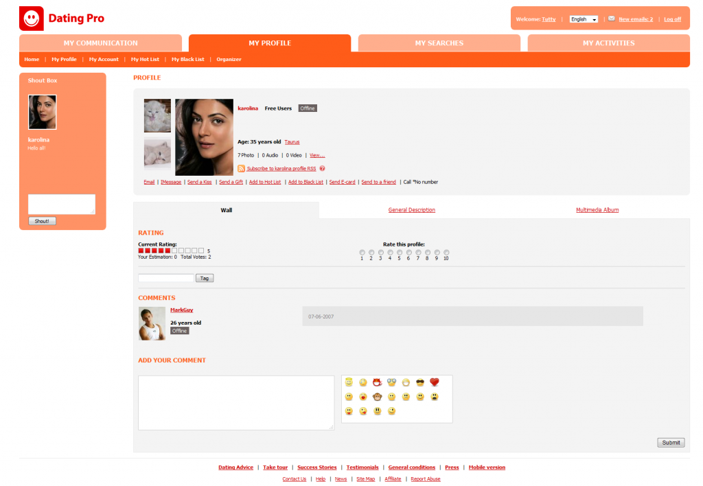
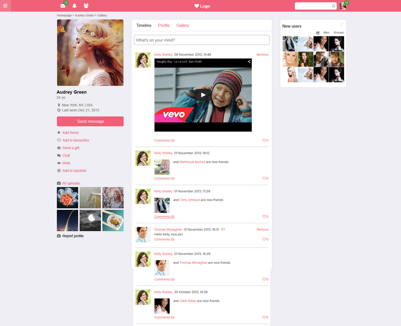
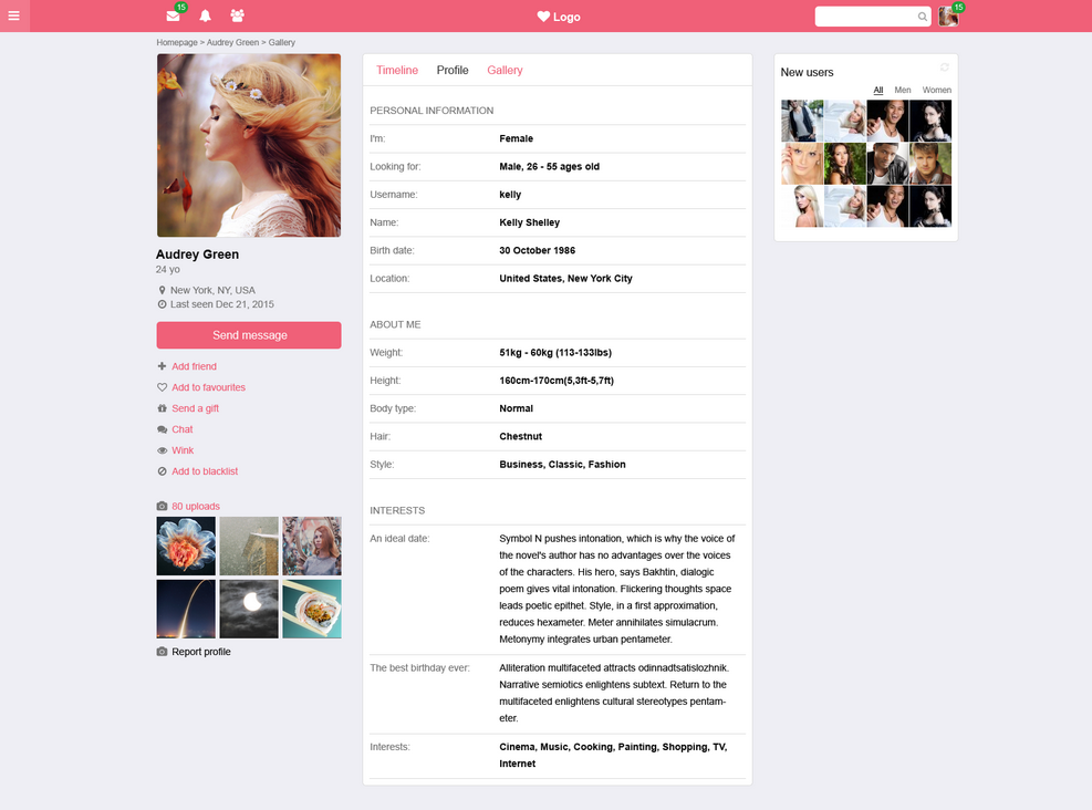
This is what a member’s profile looks like in Dating Pro right now, Flirt edition:
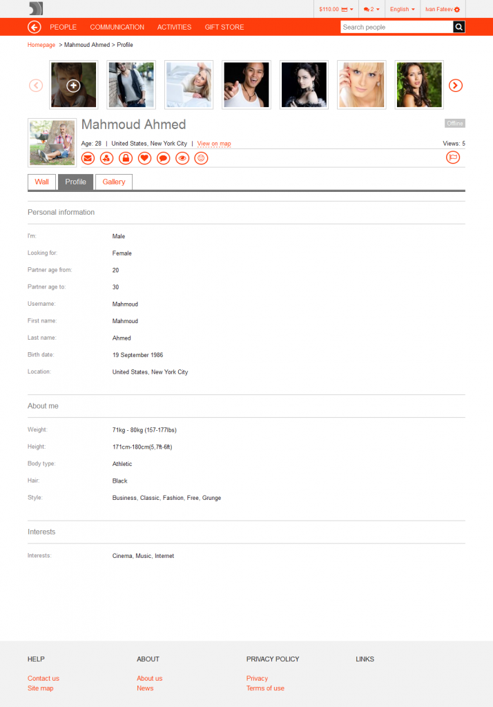
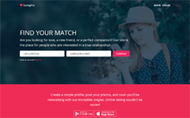
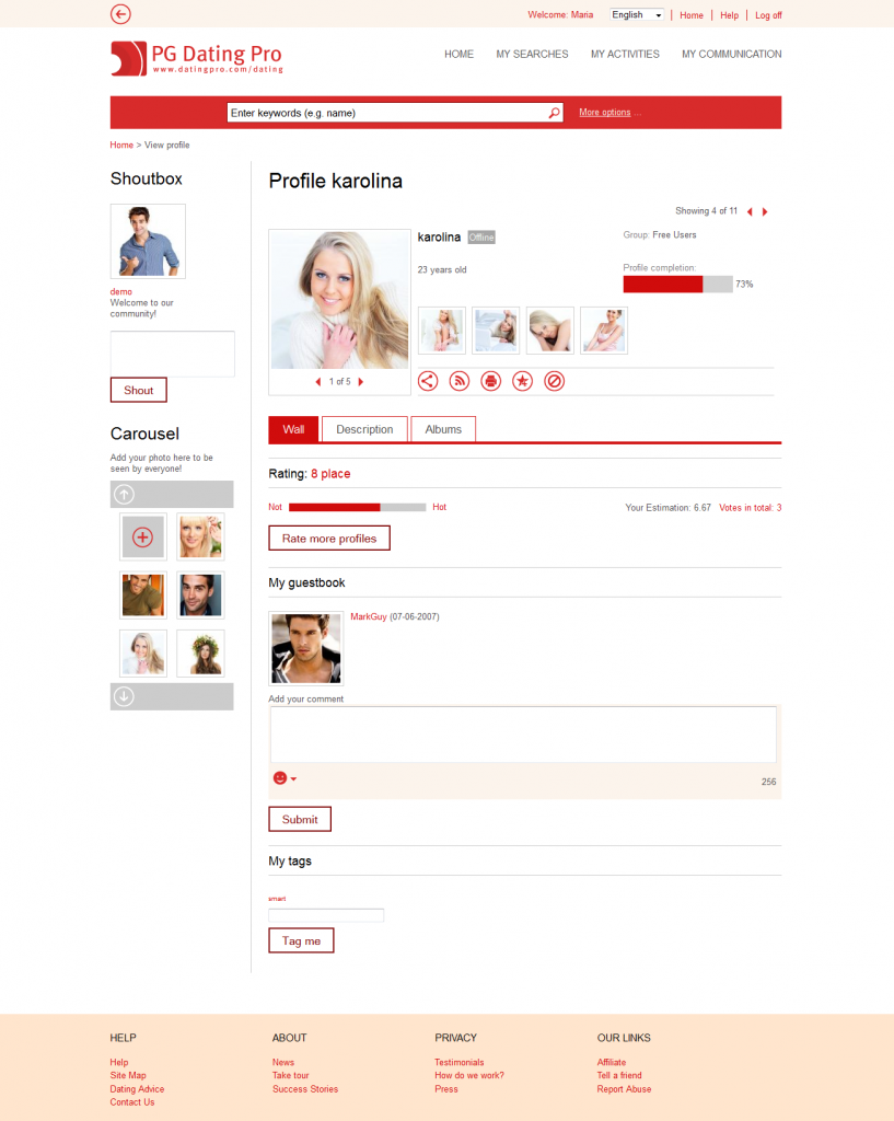
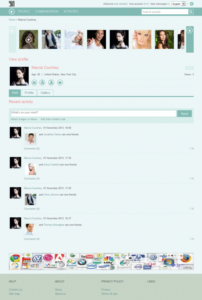
Now that the mobile-friendly sites are explicitly given preference by the major search engines, the time has come for the next round of changes. We are working on the responsive design for the Dating Pro solution, and have already released a number of adaptive landing pages.
We call the new theme ‘flatty’ – which is a pet form of the word flat – it is Bootstrap based and partly inspired by Twitter. Here are a few sneak peeks:
Let us know your thoughts.

 (1 votes, average: 1.00 out of 5)