

How to Design a Dating Site for Your Target Audience
We talked about defining your target audience in some of our previous posts. Today we would like to go into details about how to appeal to your target audience visually.
A dating website or app should be “clicking” with your audience. People are supposed to be enjoying your service because this is where they are going to meet and communicate with other like-minded individuals. Design can be just as good at expressing information and intentions as a well-written marketing prospect.
Having no audience is like having no goal. Outstanding web designers have a good grasp on this concept and always try to incorporate a message in their layouts, colour schemes, and even font selection. So where do you start?
Research
It is important that you and your design team study your target audience and understand the people you want to send the message to. It is especially easy if you run a niche dating service and have an expertise in the field. Instead of just focusing on gender and age group, you can build upon the special characteristics that will strike home.
A dating site for photographers or a dating site for geeks will likely look different, building upon what’s specific to this demographic group. Photographers would want something classy, visually appealing; geeks would prefer allusions to their favourite TV series, comic books, or characters, and so on.
Even if you’re not a photographer or a geek yourself, you can browse dedicated forums and communities online; see what’s trending, what makes people excited.
Say, we have a dating service and we roughly know our target audience. Now, we want to create visitor profiles in order to understand how different people from our target audience perceive our design. We make our virtual visitors as real as possible by giving them names, jobs, and friends. This is the best way to have a glance from a different perspective. It is called case studying.
Create for your audience
When you are done with case studying, start planning your design: outline your prototypes and compare them to what your audience actually likes.
- Laying Out Content
How should a dating service build their site and layout content? It depends on your service. If you are aiming at a younger audience, try using wide layouts that are trending and look fancy. This makes content more appealing to younger people. On the other hand, older people may prefer a narrower layout with information clustered in the middle like years ago. Depending on your audience, your layout choices may vary, and it is completely all right.
- Choosing Colours
While some colour choices are obvious (like not choosing black for a wedding theme), some colour choices may be subtle. A dating website could lean towards a more romantic light blue/pink colour scheme when aiming at romantic people and choose a darker red/black seducing scheme if their targets are free people searching for a short romantic adventure without commitments.
- Choosing Fonts
There are great libraries of fonts that any designer can use at any given moment of time. Take a look at the Google’s Web Safe Fonts Collection. This place is stacked with great choices that can drastically change the way your website looks. Again, fancy modern fonts will work for a younger audience, and more formal Arial will make older people comfortable.
- Working with Content
Wording and using language correctly is pivotal. If you want to target an audience of adult people searching for a hook-up, strong language may be appropriate. However, a dating service that wants to connect people on different levels should be as formal as possible and subtly use slang to emotionally highlight some bits of content.
————————-
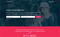
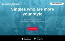
When you have all your pieces in place, the website looks like a cohesive holistic platform with information. This platform speaks to visitors and invites to explore it. Take a look at some of the websites that managed to achieve this balance.
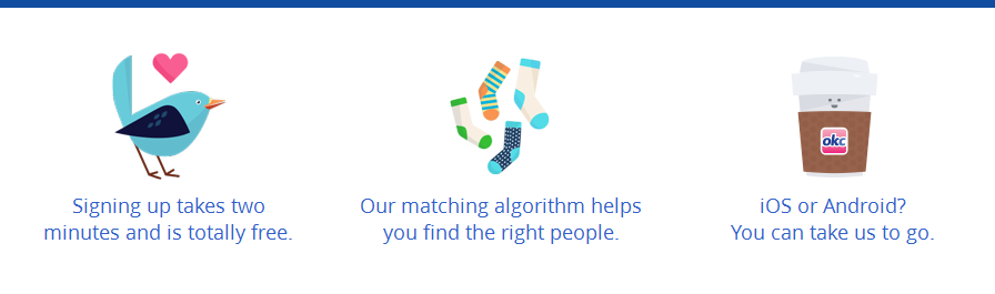
OkCupid’s design is clean and modern, straight to the point. By using flat bright colours and playful illustrations, the designers make it special and memorable.
Badoo is also bright, stylish and clean, as it caters to a younger audience.
Zoosk displays video animation in the background, which makes for a nice vivid experience. This is also a good example of a website that speaks to its audience.
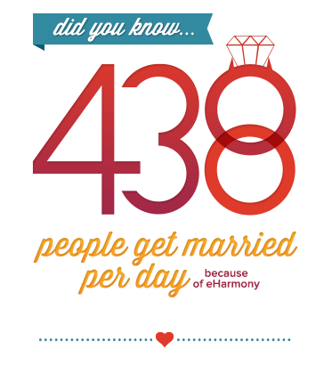
eHarmony is more traditional in that it uses a narrower layout and presents a lot of text information. However, it is mixed with the infographics style pictures to make for an easy reading.
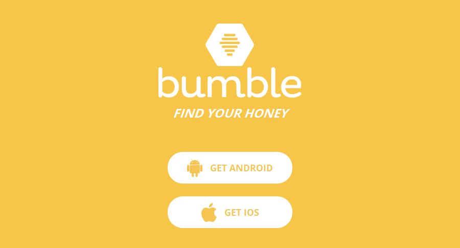
Bumble’s landing page is a great example of how you can play around with the main idea. Shades of sunny yellow, logotype in the form of a bee’s cell, ‘Find your honey’ slogan all add to the overall impression and make it really edgy and interesting to the modern audience.
The main post photo is by Jonathan Simcoe at Unsplash.
 (No Ratings Yet)