


Dating Pro: Designing Search Results Page
What does designing a web product actually look like? How do people come up with ideas? It is interesting to observe other people’s working process especially when what they do is visual.
Vladimir, the leading designer at Pilot Group, has agreed to tell us in details how he got sketches ready for one of the sections of the future Dating Pro responsive theme.
What can a dating site not do without? — A way to browse through the site members and preview their photos and short bios. This is why we’ve paid close attention to the design of the search results page, and this is Vladimir’s story.
SEARCH RESULTS PAGE
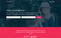
“We need to design a search results page.
We go mobile first and begin with the phone screens. Before we can start positioning elements on the screen, we need to compile a list of all the elements that will be used on the page. This is the list we’ve come up with:
– Search form: gender, age, location.
– Headline.
– Switcher for the view mode from Gallery to List and back.
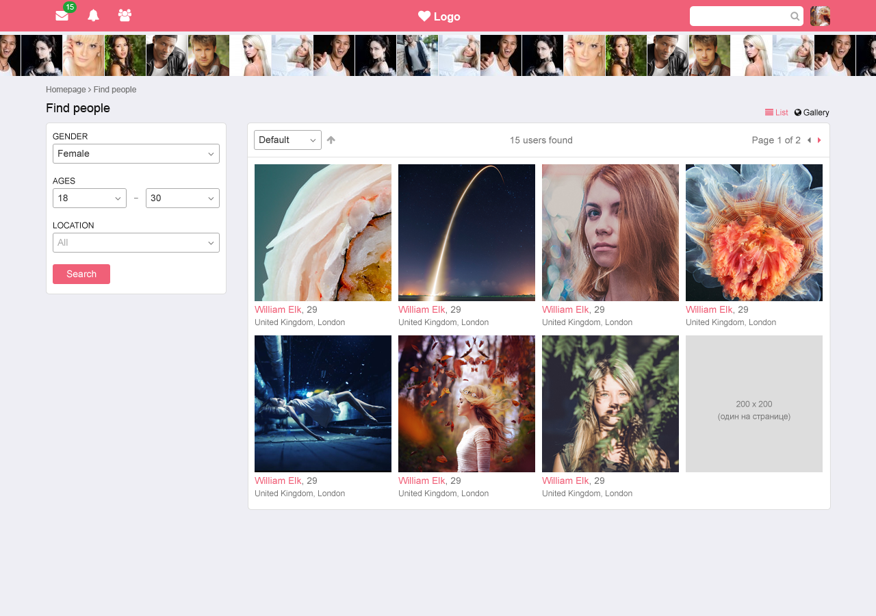
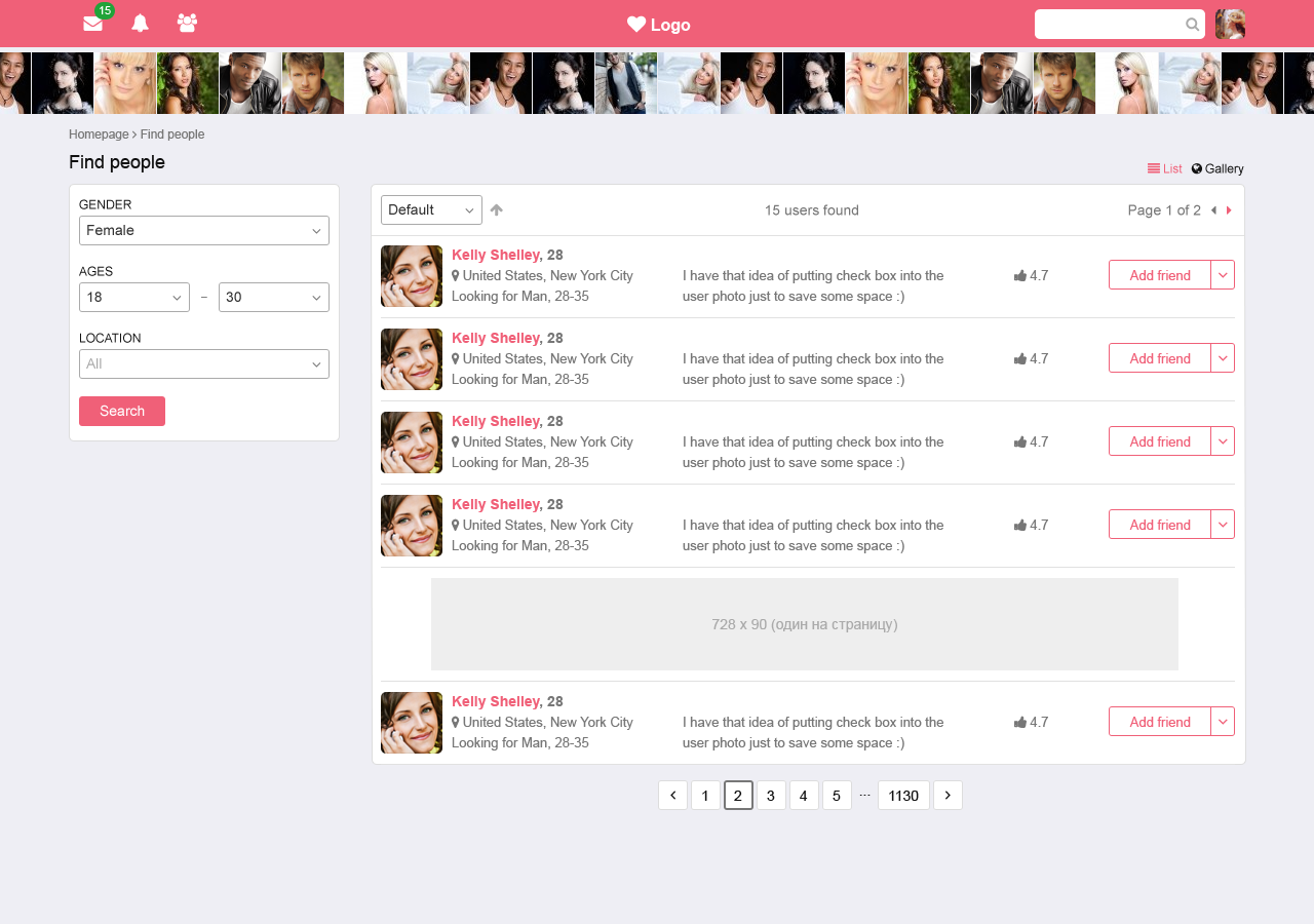
– List of members. For the gallery view: photo, name, age, location. For the list view: photo, name, age, location, rating, partner info (who the person is looking to meet), intro message, activity button.
– List sorting options: descending, ascending; pagination.
And that’s the first outline. On the very top comes the area with the search parameters, the filter:
Immediately we see the shortcomings:
– The parameters area may not fit into the screen if more parameters are added later, or if they are given longer names, for instance after localization.
– The parameters area is above the headline which disrupts the page hierarchy. What we can do here is move the parameters below the headline, but the first problem still persists.
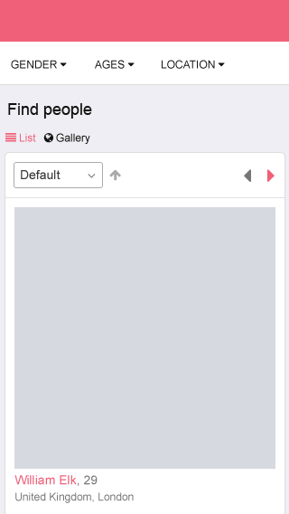
We can assume that a person will not be changing the search parameters too often. Hence we can display them on demand. At the same time parameters should be easy to notice and access. We put all parameters into the popup block that will appear upon click on the (hamburger) menu icon across from the headline:
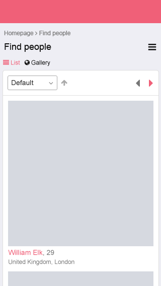
After a discussion with the colleagues we come up with an idea that the purpose of this menu might not be immediately clear to the site users. Let’s make it into a button with an explanatory text for now. Yes, it takes more space but it is a bulletproof alternative in terms of visibility. We’ll be able to get back to this button again in the future:
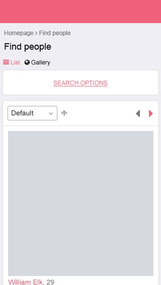
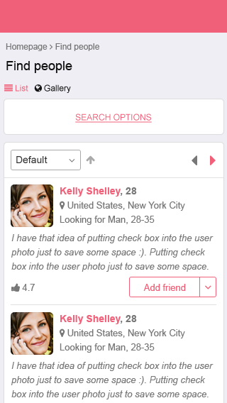
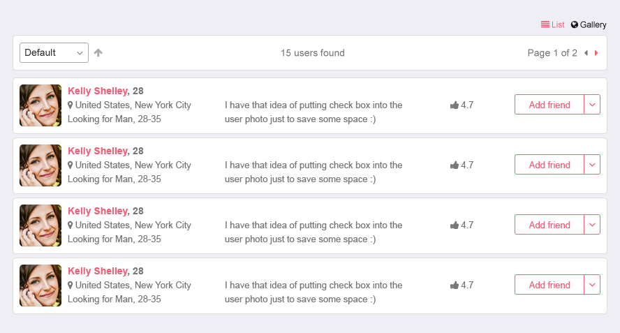
List view is for people who like to see a lot of information at once and who do not care about the big photos. The list view also lets users do something on the spot like add someone to friends (request friendship), add them to the list of favourites, send a message, and do other actions without having to go to the person’s profile page:
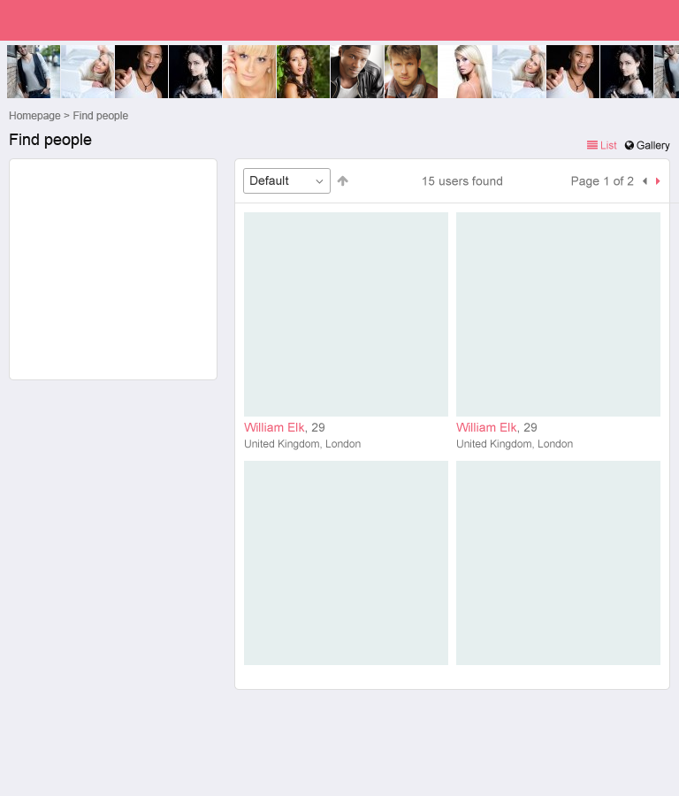
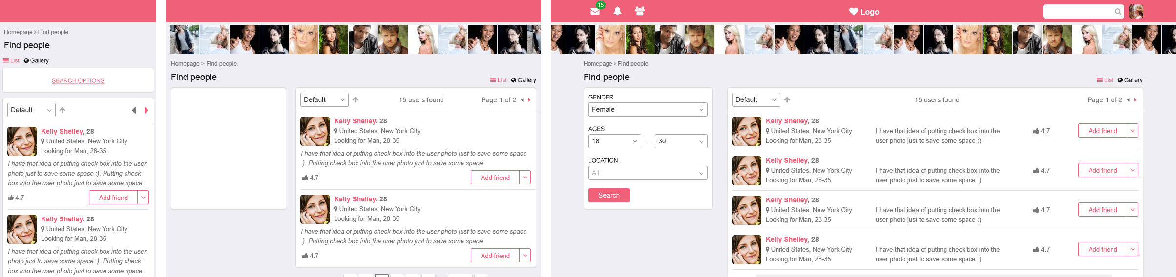
Now it’s time to increase the screen size to fit tablet-size devices. To speed up the process we use placeholders. To the left there is now space for the search form. To the right it appears best to display two photos in a row in the gallery view. Above the list we will put some extra information about the search: total number of users found, total number of pages and the number of the page we are currently on:
The list view remains roughly the same as in the mobile version, it only gets wider:
Next comes the desktop screen.
Here we need to examine in more detail the content of the panels. Let’s also allocate space for standard-sized banners:
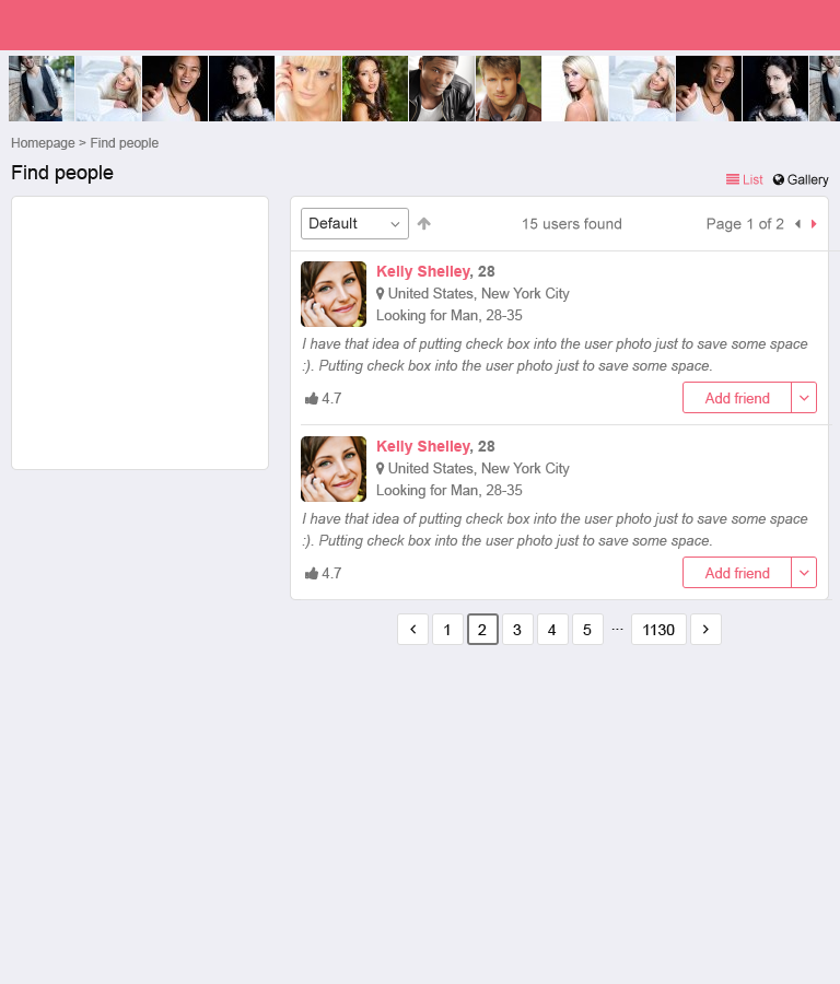
In the list view we now put all information in one row. If a site member has not posted an intro message nor has any rating yet, it is still ok, and we can save up on space a little:
This is an alternative list view. It might look good on mobile devices thanks to individual backgrounds of every user block, but because every block height is so small, there are too many horizontal lines that create visual noise. That is why we go with the previous layout.
And this is what we’ve gotten as a result. For clarity we put all the screens/sizes together.
Now it is time for developers to start their part of the work. But it does not put an end to the designer’s involvement. Designer should always keep an eye on the process of implementing design into HTML pages. Any questions and issues that arise are discussed in the circles of team members.”
Hope you liked the story. Let us know what else you would like to ask our designers and developers.