


UX Labyrinth: Designing the Perfect Onboarding Flow for a Dating Service

Think about the moment when someone opens a dating app for the very first time.
Their heart beats a little faster, fingers tap the screen with excitement – maybe, just maybe, this is where something special begins. And then… the magic is broken. A long, clunky form appears, asking for too much, too soon.
That first impression matters. Registration isn’t just a form. It’s the first kiss of your product. If it feels heavy, confusing, or demanding, the user leaves. And once they’re gone, they rarely come back.
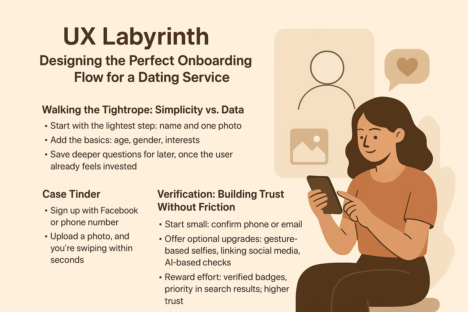
Walking the Tightrope: Simplicity vs. Data
Yes, you need data to make the product work: age, gender, photos, preferences. But every additional field is a risk. The longer the form, the steeper the drop-off.
The trick is to design onboarding like a conversation, not an interrogation.
-
Start with the lightest step: a name and one photo.
-
Add the basics: age, gender, interests.
-
Save deeper questions for later, once the user already feels invested.
Tinder nailed this idea early on. Sign up with Facebook or phone number, upload a photo, and you’re swiping within seconds. The product delivers its “magic moment” immediately.
Bumble takes a slightly different path. Their registration is deeper, but every step is framed with purpose: the more you share, the better your matches. Users accept it because the value is clear.
The lesson is simple: people don’t join dating apps for forms. They join for emotions. Give them that spark quickly, or you lose them.
Verification: Building Trust Without Friction
Dating apps live or die on trust. Fake profiles, scammers, and trolls can ruin the experience faster than anything else. But here’s the challenge: verification is essential, yet too much friction can scare users away.
The answer lies in layers:
-
Start small: confirm phone or email.
-
Offer optional upgrades: gesture-based selfies, linking social media, AI verification.
-
Reward effort: verified badges, priority in search results, higher trust.
Badoo pioneered gesture-based photo verification. At first, some users hesitated. But it worked. Trust inside the community rose, and verified profiles became more attractive. The badge itself became a kind of currency – a signal that someone was real and worth engaging with.
How Not to Get Lost in the UX Labyrinth
Designing a registration flow is not about filling out fields. It’s about emotions. Every second of the process should work toward one goal: keeping the user engaged long enough to feel the product’s value.
-
Start easy.
-
Build trust.
-
Then go deeper.
Registration is not just the gate. It’s the road to connection. If you turn it into an engaging journey, users won’t feel like they’re completing a form. They’ll feel like they’re already moving toward the very thing they came for.
Lessons From Market Leaders
| Service | Registration Approach | Verification | Key Takeaway |
|---|---|---|---|
| Tinder | Minimal steps, quick entry via Facebook or phone. Swiping available right away. | Phone/email first, optional checks later. | Deliver instant value. Users should swipe or match immediately. |
| Bumble | Slightly deeper setup: photo, description, interests. Every step explained. | Phone/email + optional photo and social media checks. | Justify every field. Make effort feel meaningful. |
| Badoo | More detailed profile, but split into small steps. | Gesture photo verification + visible badges. | Reward verification with visibility and trust signals. |
| Hinge | Focus on personality. Prompts like “My ideal day…” shape deeper connections. | Basic phone/email check. | Works for audiences seeking serious relationships. Profiles can be deeper if the tone is playful. |
| OkCupid | Long questionnaire, dozens of questions. | Basic verification. | Best for users who value depth over speed. Willing to invest more upfront. |
The Ideal Flow in Practice
Every dating service positions itself differently. Tinder is about speed. Bumble is about meaningful matches. Badoo is about trust. Hinge and OkCupid focus on depth.
But no matter the positioning, the principle stays the same: the first experience must deliver emotion, not frustration. That’s what turns registration into a journey instead of a barrier.
And if you’re thinking about designing or improving your own dating product, our team at Dating Pro can help. We’ve built platforms like this before, we know the pitfalls, and we know how to craft onboarding flows that keep users hooked from the very first tap.
Reach out, and let’s talk about your project.