


10 Best Practices to Boost Your Landing Page Conversions
Yesterday, we talked about landing pages and dynamic content on them. Now, I want to talk about some other cools tricks you should use to make your dating site landing page attract as many users as possible.
And according to Hubspot “the typical landing page converts at 5 to 15%, but some landing pages that are highly optimized convert at 30% or above”.
You just need to follow my steps mentioned below and you should be covered.

1. Create a persona
You can possibly expect that everyone who is now using the Net would want what you offer. There are millions of people, with millions of needs and interests.
This is why a persona (a.k.a buyer persona) is used. Through it, you will get to know their personality, age, habits, budget and other characteristics that will help you “sell” your offer.
Once you finish the persona, you will have a clear idea of what you need to put on your landing page, everything will be according to needs and wants of your ideal customer.

2. Define your goal
Basically, you need to understand why this landing page exists – is it to fill out a form, sign up for a free trial, download something, register for a meeting or webinar, subscribe to a newsletter and etc.
There is an important rule and it’s to stick to a singular goal. When there is only one option you want your users to accomplish, then it minimizes the amount of choice they have. And it’s easier to focus on a single thing at a time than on several things.
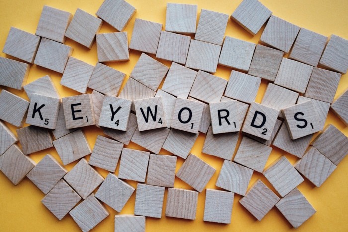
3. Target the right keywords
Your choice should be long-tail keywords, usually, they have higher rankings and higher ROI.
So try to focus on specific terms. For example, your specialty is speed dating, your target location is New York and you want to target elder people, so you should go for “Speed dating for seniors in New York”. Makes sense, right?
4. Write a catchy headline
Headlines are the first thing your users will see on your page, so it’s extremely important. Like as the ultimate expert David Ogilvy said: “On the average, five times as many people read the headline as read the body copy. When you have written your headline, you have spent eighty cents out of your dollar.”
Here is an example:
This headline answers what you will get and why should you get it. No frilly words, no empty promises. Precise reason and end result.

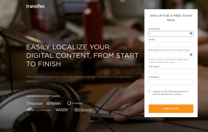
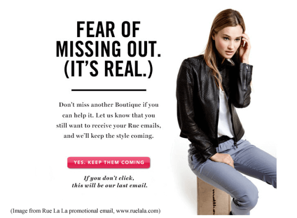
5. Create an irresistible Call To Action
This one is simple, make your CTA so attractive to site visitors, that it’d be hard for them to not to click on the button.
One of the most common CTA technique is “fear of missing out”. People hate missing something good or worth their while. So when your button reads “if you don’t click me you will miss out on the hotest dates in your area”, very few people will actually not click it.
Here are some examples:
6. Use only one CTA
Remember? One page = one focus = one CTA.
People are prone to click randomly on the links and skip the very CTA you actually want them to click. So the fewer buttons or links you have, the higher chance they will click what you want them to click.
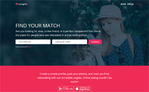
Let’s take this page as an example:
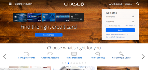
How quickly, do you think, you’d leave this page? There are two buttons in the first block – should I click the left button first or fill in the form on the right? Then we see 5 links with a carousel which means there are more links… And it’s just first two blocks of the page, phew.
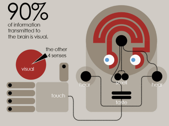
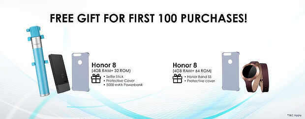
7. Use visual content
Humans are created in such a way that creating images from nothing is hard. They usually can’t read a text and see the image in their mind. They need some visual foundation to that – images or videos.
On top of that, images can be used to further enhance your message. For example “eat healthy food” – ew those steamed carrots and broccoli – that’s what they think by just reading the text. But what if you add a lil bit of images like so
Using a vivid and positive image, you make them want to achieve the same results as shown on the image which ends in higher conversion from your page.
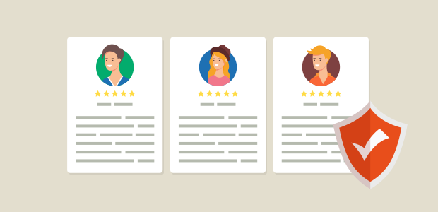
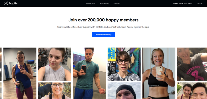
8. Include social proof
Another human peculiarity – we don’t trust these personless texts from a site you never heard about. We need some proof that this is useful for us and that other people are using it too. Like “9 out of 10 dentists recommend xxx”, sounds silly, yeah, but it works. And god, it works well.
A survey by Bright Local reveals that “91% of consumers trust online reviews as much as personal recommendations”.
There are only so many different types of social proof you can use:
- Testimonials
- Case Studies
- Customer Ratings & Reviews
- Influencer Endorsements
- Certifications
- Brand Logos
- Client Logos
- Subscriber Counts
- Social Shares Counts
- Social Connections
- Test Results
- Storytelling
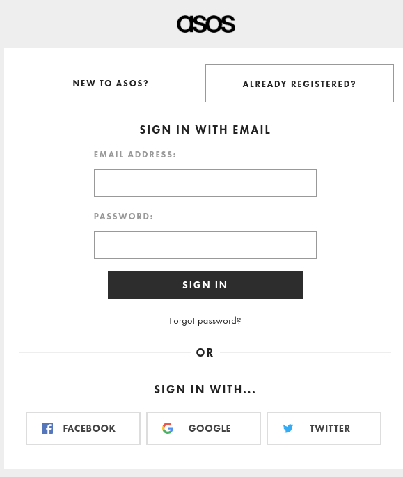
9. Have a social login option
The secret behind getting high conversions (conversions into paying users as well) is to make the process as easy and simple as possible.
This is why social login buttons exist. Why feel all those nickname, email, password, birthdate fields when you can simply click the Facebook button and you’re done?
Not only will they be able to log in and use your site in a single click, but they’ll also be able to share and recommend your site to their friends.
10. Add analytics tracking
Tracking is a must have. Without analytics, you won’t be able to tell whether your changes made the page better or not, what page element attracts the most attention, what should be removed and etc.