


Dating Site Reviewed by Experts, Episode Seven
Dear friends, this is our next video in the series of dating site reviews. Check out our previous review in this blog post.
Today, we will be taking a look at an unusual design arrangement at the EastLovesWest.com website. As usual, we will be taking a look at the main page, the search page, and the profile page, so let’s begin.
Watch the video review on YouTube or keep reading the post below.
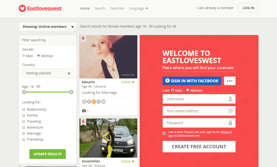
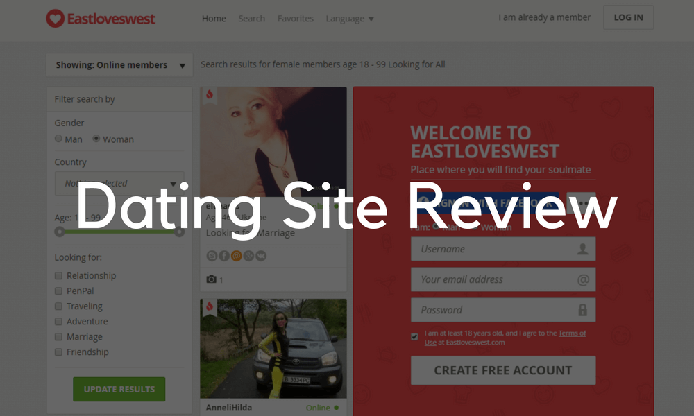
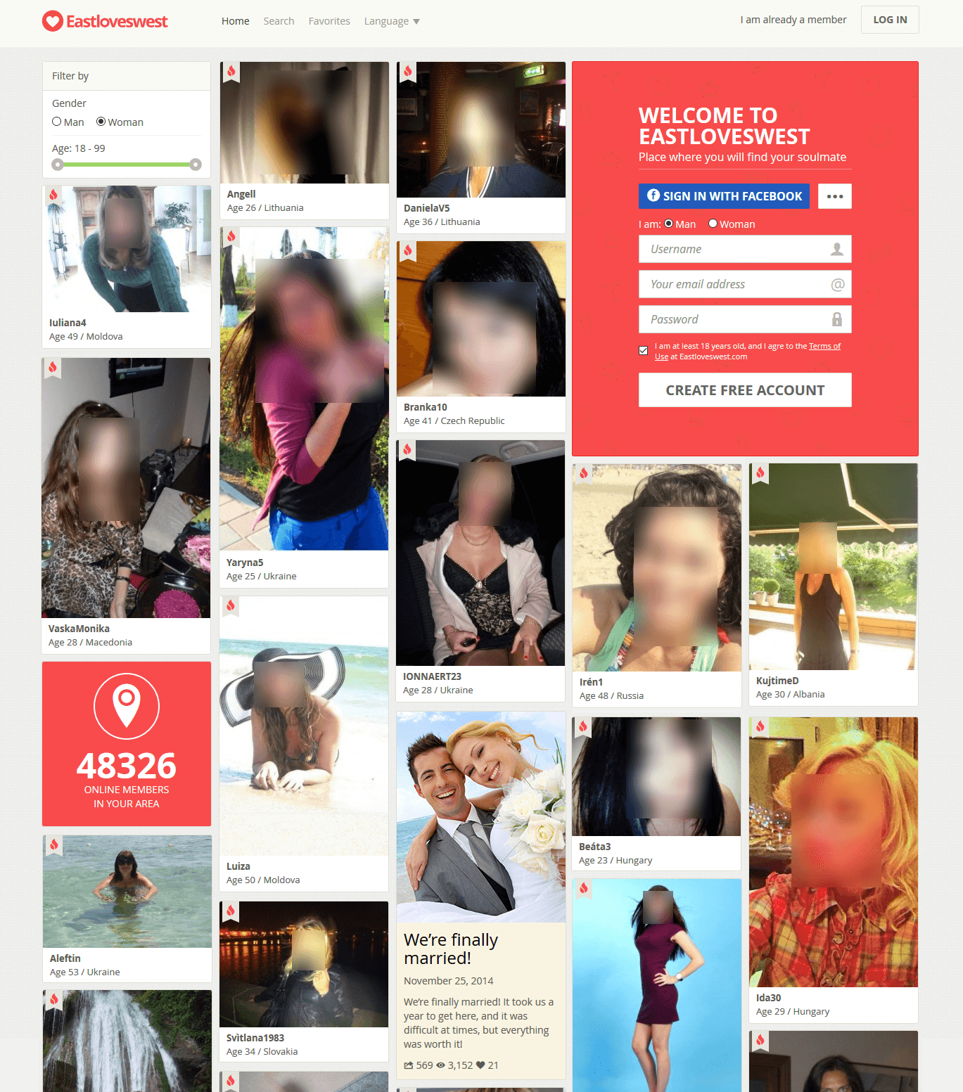
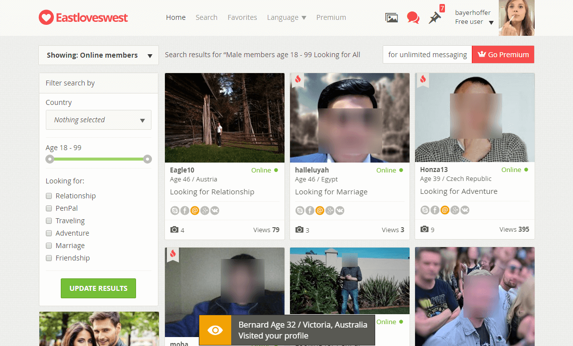
Unlike what you might think, this is actually the main landing page of the website. The standard practice is to display a block of users, either by their status, like VIP/online/recently joined or by location. EastLovesWest, however, allows the guests to search through the whole database right on the main page. It can be a bit confusing at the first glance because as site users we all have a certain image of what a site’s main page should look like. This site breaks the mould, though, and sparks the interest right away.
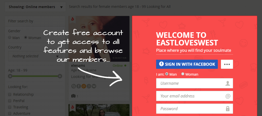
It could be great if they did allow us to see the profiles before we sign up though. Just efficiency-wise because people like to get a little something free before you have to pay, before you have to do something for it. It could be more engrossing if you could actually open 1 or 2 profiles without registering because right now the site prompts you to create your own profile immediately after you click any action button.
There are a few modifications that we can come up with, especially from the design point of view. This kind of a page creates a lot of visual noise. Basically it’s a search page so there are quite a lot of search parameters, there is quite a lot of info, for example, nickname, age, location, reason for joining the website, social connect buttons, etc.
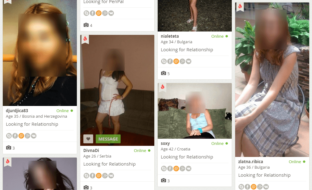
It would help focus the attention of the new visitors if the site owners could either reduce the number of filters, maybe leaving the gender and age as the most important parameters, or reduce the amount of info on members.
In order to stay interested, people should get the results in the minimum possible number of clicks. Plus, it seems like a good idea to keep the atmosphere of mystery for a bit longer and show less info about people on the site. Right now a new person sees all they need to see, and joining the site doesn’t really unveil anything new, it just gives them a way to talk to people _if_ they liked them visually _and_ judging from their info.
As a way to reduce the visual noise, I think it would be great to leave out the social icons because pretty much no one bothers to fill out this info, so only the email address is available.
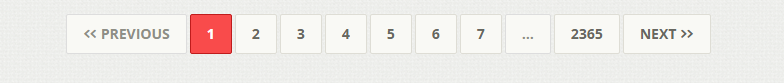
Alternatively, we could engross the new visitors and give them a glimpse into the site activity by using the infinite scrolling instead of the pagination:
The fewer clicks people have to make, the better. Plus, it could potentially help draw more attention to the other blocks that are lost under the search, since the search is such a powerful attention magnet, for example, site stats and success stories.
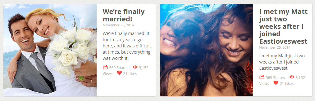
Surely, it would also mean that the success stories and the join-in invitations would have to join the same flow. This way people, while scrolling the search results, will see reminders of the opportunities this site can give them.
This is what our designers came up with as an alternative solution — a dashboard that will use all of the mentioned elements, including the success stories, and the stats, and display them along with the search results:
In the redesigned search form, you see only the most important filters to pique curiosity. And now and again, you come across the stats and success stories embedded among the search results. Thus, a person visiting EastLovesWest will always be reminded of what the site is about.
The dashboard might also improve the SEO situation. The site owners would be able to use more texts with the important keywords on the page. In the original design, the only promotion text is this short intro at the very bottom of the page. The dashboard could be a way out because one can place unlimited texts there.
Now, let’s log in and see how the website looks from the inside. It does not look any different from what we’ve just seen. There’s the same layout, the same search, with the addition of new options and a user icon in the top right corner.
The ‘Home’ and ‘Search’ pages are basically one page, with ‘Search’ opening the Advanced search block on top. You can open this block from everywhere on the site, which is good, but at the same time, it’s not good because after you’ve chosen the parameters you want, the block hides and you see the page with fewer filter options that there has just been. Also, in order to refine the search parameters, you will need to open the search block again.

If you’re really into searching, we think it could easily irritate you. You have to click on the search box, then set the parameters, then click Update results, and so on. Also, a saved search option with push notifications might be useful.
A suggestion to the site owners: either bring the search parameters as an extra box to the top of the page but out of the top menu, or possibly expand the search box on the left. That would save the search enthusiasts mouse clicks and going back and forth.
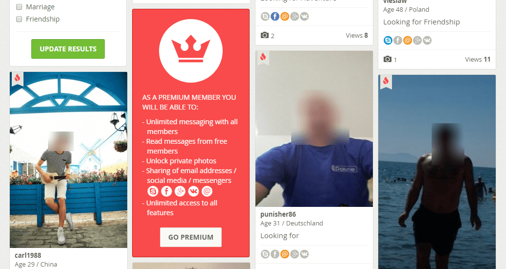
What’s good is that the website owners take the chance to advertise the Premium subscription by weaving it into the search results:
If we look at a person’s profile, we’ll see that they built it in a very attractive way. What we can see right away is the photos and the action buttons which are Like, Favorite and Message a person. We don’t know why the website chose to give the site members a way to connect on different social platforms. That is the exact opposite of what dating websites usually try to do. They try to get people to stay online for as long as they can, to spend more time communicating with other site members, and to ultimately spend more money with them.
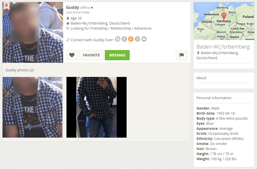
(Note to the ELW owners: Guys, check the character encoding in your database, this is not the way to spell Baden-Württemberg.)
Other than that, we haven’t found any other flaws in the profile pages. The information about a person is arranged very neatly, although they might consider not displaying empty blocks — in the above screenshot it’s the ‘About’ section. To a page visitor, it may seem a bit off. It looks like something’s broken, while in reality the person simply hasn’t answered some of the profile questions. Other than that, the profile page looks great.
All in all, the site offers a very interesting design solution for the main page, and the inside pages as well. It does grab your attention because it’s so unusual. At the same time, as we’ve discussed, it can have its drawbacks in how visitors and new members perceive the website. That’s our opinion, you can share yours in the comments, and we’ll be glad to learn about it. Let us know what you think!