


The Power User Curve Or The Best Way To Understand Your Most Engaged Users


The importance of power users
Many successful companies development is driven by the power users – people who love their product, actively use it and make a valuable contribution to the development of the user network. For example, influencers on social networks, people or celebrities who have a lot of readers and can have a say in any subject.
And it’s true that all companies want more power users. But before getting more and more of them, you’ll first need to understand how to measure and analyze their activity. Common way is to use DAU / MAU (number of active users per day/month), but these metrics have their drawbacks.
Thus a Power User Curve was created, to gain a more in-depth understanding of users on your site and app. You may be already familiar with it from the Facebook growth team’s activity histogram or the “L30”.
This histogram shows the user’s engagement by the total number of days in a month when they were active, from the first to the last day of the month. Usually, it reflects the basic activity like opening an application or logging in, but it can be configured to display any actions that you want to measure.
Let’s look at the advantages of the Power User Curve over DAU / MAU:
- The curve shows if you have a core group of power users that comes back every day.
- It shows your users heterogeneity: some of them are almost not engaged, others are power users. DAU / MAU, show a single number and skips this difference.
- When comparing with cohorts, the Power User Curve will show you whether user engagement is getting higher over time. This helps to evaluate the success of a product launch and other functionality changes.
- The Power User Curve can be configured for any action. This is important if the key user actions are performed deeper in the engagement funnel.
In other words, DAU / MAU show a single number, and the Power User Curve provides entrepreneurs with several analysis options to evaluate the involvement of the most engaged users in their product – at a particular moment, over a time period or in connection with monetization. It is very useful.
So how does it work?
Power User Curve will “smile” if things go well
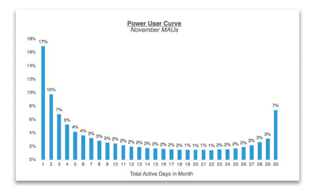
The Power User Curve above describes a social-networky type of a product, and the shape of the smile shows that a group of active users uses the application on a daily, or almost daily, basis.
Social products with this high user engagement are well monetized through ads because this product has enough users that can provide enough ad views.
It is important that the platform should be able to retain and develop its power users over time.
Ideally, the Power User Curves, for successful products, should show how users move to the right part of the curve. Most likely, with increasing density and influence of the network, users have more reasons to come back every day.
Power User Curve can show where you most need monetization
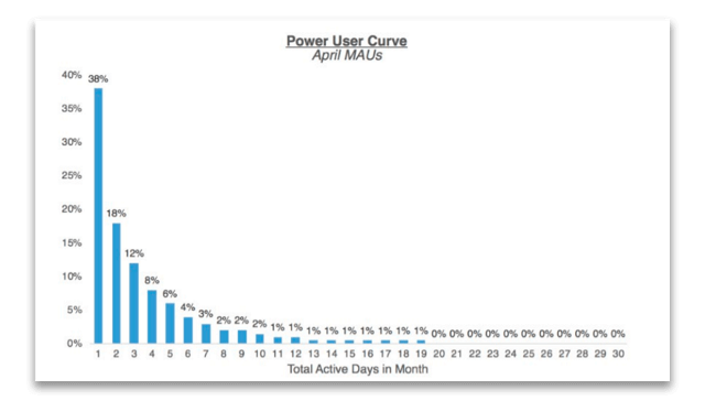
This Power User Curve shows the statistics of the professional networking product and it differs from the curve of the social product.
It is more inclined to the left side, users are active only a couple of days a month and the curve is rapidly dying away after these few days. There are no power users. But such weak engagement level can be quite normal: not every company needs smiling curves, just like not every product category needs to strive for ultra-high DAU / MAU indicators.
Therefore, such companies should consider whether there are potential sources of income that can be effectively monetized with a small use frequency? And how they can get more users who use the product often (if even possible)?
Some products should be analyzed within 7 days, others – 30 days
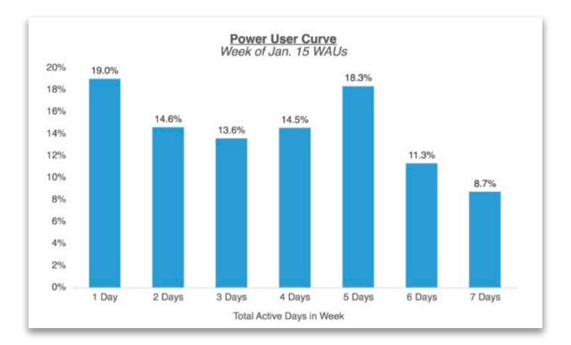
Another variation of the Power User Curve is a histogram of user engagement over a seven-day period (also known as L7). It’s usually created when your product itself lives in a weekly cycle. For example, if it is a product related to productivity or work in which users are involved from Monday to Friday.
Not every product is needed on a daily basis, and that’s fine.

The beauty of the Power User Curve against DAU / MAU is that it shows the heterogeneity of your user base, reflecting the nuances of different user segments (and what drives each of these segments). Creating a Power User Curve for different segments can give a lot of insights. For instance, for a business with local network effects (like Uber or Thumbtack), showing Power User Curves by the market can reveal which geographies are developing density and strong network effects.