


11 ways to increase сonversion on your online dating site
There are always ways to make your dating site even more profitable and convert even more regular users into paying members.
First. let’s set up a benchmark. General conversion rates in e-commerce are 0,3-8%. Where 8% — is a super good conversion, and 0,3% — is okay for conversion too. But that just average numbers among all sites.
I see the goal – I reach it
When we have our standard conversion rate, we’ll need to calculate your current conversion. How to do it? Just take all of your payments and divide it by all your users then multiply by 100.
E.g. you had 30 membership payments in December. And the overall number of site users is 1000. Which means your conversion = 30 (membership payments) / 1000 (all site users) * 100 = 3%
Now, when we have a benchmark and real conversion, we can set out goal conversion that you want to reach with the following tips, for example, reach 3,5% in the next 2 months.
1. Work on traffic quality
Incoming traffic quality matters. It’s better to attract a small number of people but that are truly interested in your service and that are more likely to make a purchase than a crowd of random ones.
2. Optimize the payment section
The inconvenient or incomprehensible payment section is one of the reasons why users abandoned their carts. Here are some tips on how to make purchases on your sites easy and painless:
- Let all the necessary info and the credit card fields be located on one page. First, it’s just more convenient that way, and second, the user will immediately see what is required.
- Do not ask the user to input the fax number, mother’s maiden name or the dog’s name, ask for a minimum of really necessary data.
- Reduce the payment process as much as possible. Giving away money is always stress for users, so you’d want to make it as fast as possible, like tripping off band-aids.
- Set up as many payment methods as possible. Do not rely on each of your customers having a VISA card or Paypal account. Add more options to expand your audience.
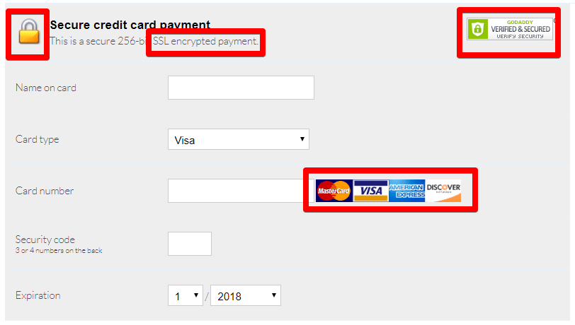
3. Provide security
In a survey conducted by Econsultancy, 58% of respondents claimed that they didn’t finish the purchase due to payment security concerns.
It’s important to make sure that users are not afraid to send you money. The following can help you with that:
- popular payment systems logos: VISA, Mastercard, PayPal;
- https protocol – it provides more protection than http;
- a license agreement page where all the interactions between the seller and the buyer are described in detail;
- a separate block about the refund conditions, because users choose the goods almost blindly and always assume that there is a possibility to return the money if the purchase does not suit them.
4. Collect content from customers
Be sure to collect feedback from customers and convert it into content for the site and your social networks.
5. Give away gifts and discounts
Have you ever considered promotional codes and coupons as a way to quickly earn a profit? In fact, they have a great effect on conversion. The main thing is to plan your budget so that you can afford to give away discounts.
Give users small compliment gifts and discounts. This greatly affects loyalty, and loyalty – on conversion.
Additionally, you can create a site section with discounts and update it periodically. Customers will seek benefits no matter what they want to buy. The “Sale” block will always attract their attention.
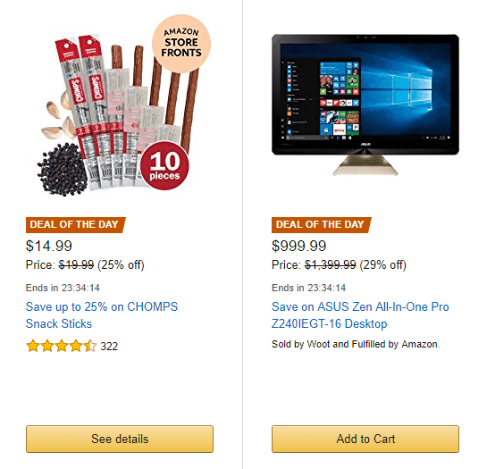
6. Have time-limited sales
Offer a big discount, but only for a few hours. Be sure to announce it to all users and put a timer to make it more engaging. Let visitors see how much time is left and how many people have already taken advantage of the offer.
You may seem such offers on Amazon:
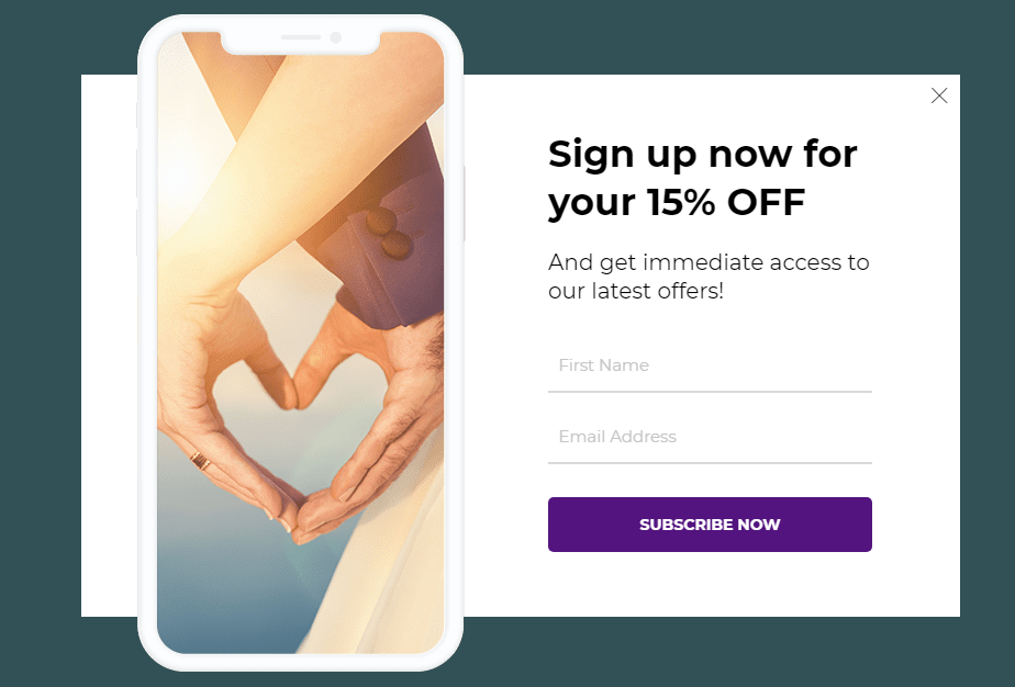
7. Use pop-ups
There is a stereotype that pop-ups are useless. But it’s not true: a global SumoMe study analyzed 2 billion pop-ups and calculated successful pop-ups conversion to be about 9.3%, some reach 50%, and the average conversion is 3%. Pop-ups work if they are properly configured and display the content that benefits the customer. For example, ’10 tips to get a guaranteed match’ or ‘full guide on how to go through your first date’ and etc
It is important to learn how to use this tool correctly. We have an article about pop-ups.
8. Share your success
Feel free to talk about your awards, satisfied users’ reviews, and cases. This is especially important for young companies that have not yet earned a name for themselves. According to BrightLocal research, 84% of customers trust reviews on the site as well as recommendations from friends. Of course, this has a huge impact on conversion to purchase: studies have shown that, on average, sites with more than 50 reviews have conversion 4.6% higher.
If you are not yet collecting feedback from customers, start now. Here are a few tips:
- eliminate their doubts that you’re buying reviews, tell them how you collect feedback, show photos of customers and their names;
- invite readers to vote for the review, to indicate whether it was useful;
- add the ability to attach photos and videos to reviews;
9. Practice upselling and cross-selling
Almost for any niches and sites. repeat sales are way more profitable than selling to newly attracted customers.
The goal of such sales is to increase the average check: upsell is to sell a more expensive product or just more products at once (buy 3 months of membership – get the 4th as a gift), and cross-sale – sell related products. The most important thing is to avoid being intrusive and drive away your users.
10. Work with abandoned carts
Every time a user leaves the cart without paying, you lose money. Site owners don’t always pay attention to this, but 69.23% of the carts in e-commerce get abandoned.
A common way to return users is through an email. For example, set up a “abandoned cart” email sequence to win some users back and get your revenue.
11. Add a CTA element
The Call-To-Action button is one of the most important elements on your site. Your goal is to make as many visitors as possible click it. There are 3 main rules for button design. So:
- let it be a bright color, to contrast the background;
- leave enough free space around it so that the button catches people’s eye;
- use a clear call in the button text.