


Dating Site Reviewed by Experts, Episode Four
This is the next episode in our series of dating site reviews performed by PG Dating Pro’s Experts team. Read the blog post dedicated to our previous review.
Before we start, please let us know what you are most interested in — the SEO advice, design, functionality, or anything else. Also, please send us links to the websites you would like us to review.
Let’s get started. Today we are talking about the WhatsYourPrice.com website. It utilizes the popular idea of sugar baby/sugar daddy interactions but offers a new interpretation with its very pragmatic and direct approach.
Watch the new video in our YouTube channel or keep reading this article.
As usual, let’s review the main page first. The very first thing you see is the registration form and you don’t need much time to figure out what the site is about because both the domain name and the logo, as well as the ‘Join the Dating Auction’/’The online dating shortcut’ slogans explain it.
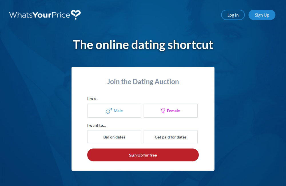
The main page of the WYP site looks very clean and free from extra illustrations and flashing elements that jump out at you. One of the biggest advantages of this page is its minimalistic approach in that the site owners don’t use much text. Nobody likes to read much when landing on a new page.
The bright red button prompts you to start the step-by-step registration process. In addition, you can use the sign-up button at the top right corner.
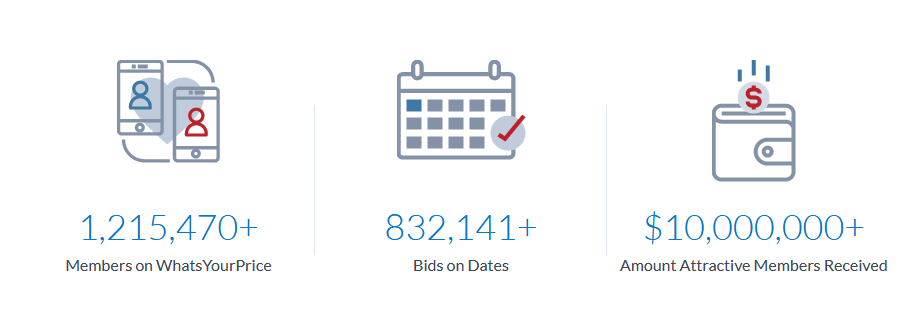
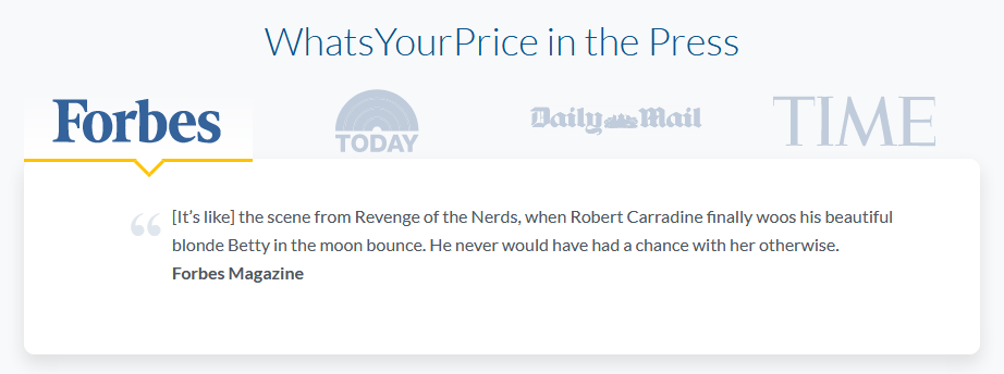
If you are still hesitant on whether or not to join the site, the site owners provide quick stats and quotes from the esteemed media like Forbes etc.
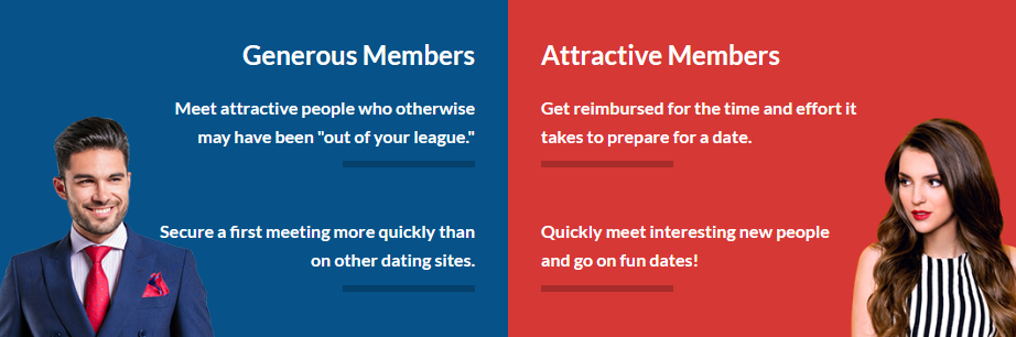
Below, you will find a block of information that is targeted at both men and women, describing the advantages that the two genders will enjoy while on the site:
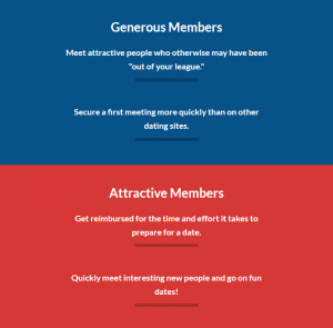
Another great appeal to join the site is below to round up the efforts:

We have a note to make about the gender advantages block. The thing is that when you view the site from a mobile device, images disappear and it does not look so obvious who the blocks are describing, at a first glance. One may have to think twice.
Next, to the registration process. It is great that the system lets you know if the password you are using is a common one and for that reason, you might be at risk of compromising your account.
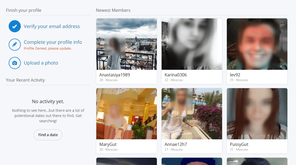
After signing up, you are taken to the dashboard where you see the newest members — it helps you get involved in the site activity right away. Even if you haven’t completed your profile and haven’t uploaded any pictures, you can still browse members and visit their profiles. You don’t feel restricted here. Though, if you want to explore deeper, you will have to complete your profile and have it approved.
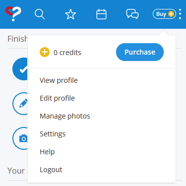
The main issue we’ve faced on this site page is the header block. Let’s take a closer look.

First of all, not every icon gives away its meaning intuitively and unambiguously. While we can understand the Search, Favourites, and the Chat icons, we are confused about what looks like a calendar icon. This is a specific site feature called Offers. Once you go here, the connection becomes more understandable, because Offers appear to be calendar-based after all. New members may still be confused.
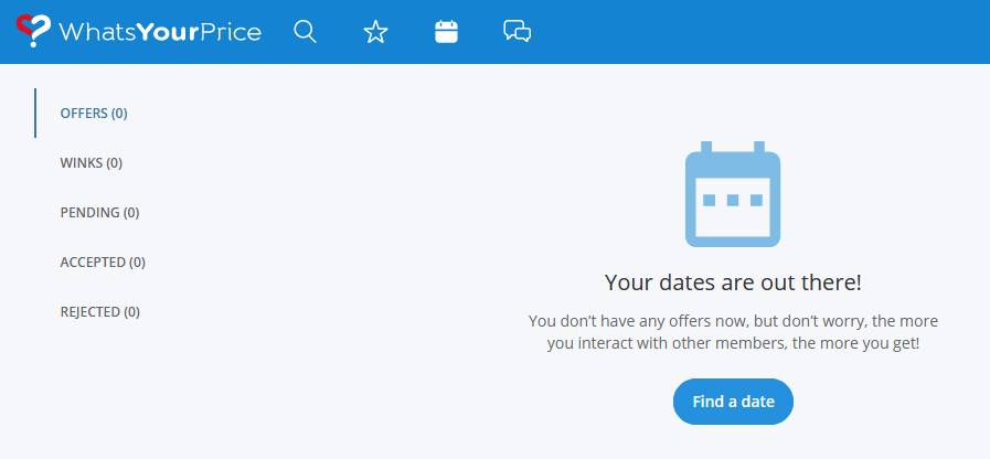
It’s a good practice to use menu titles along with the icons, or at least the tooltips that will appear on hover.
Let’s take a look at the header from a mobile device. The mobile design guides usually suggest using up to 4 header elements for the iOS and up to 5 header elements for the Android systems. However, we have 6 elements here which makes it look overstuffed:

A possible solution would be to keep the logo and hide the rest of the icons under the ‘kebab’ menu icon on the right:

One more note: the ‘Buy’ button and the menu icon appear to be two different elements, the former for the credit purchase and the latter for the main navigation, however, this is a one and the same element that opens the same content:
Now let’s take a look at the search page. This page is very clean and nicely free from distracting elements. Nothing draws your attention away so you can focus on the users:
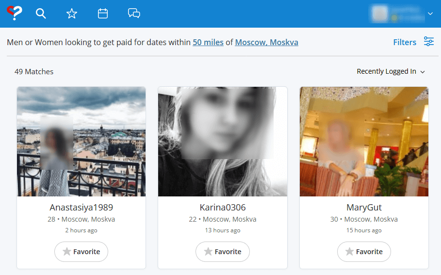
Showing big user images that feel real is a good solution because it attracts attention and makes users trust the service more.
Only the most important information is shown in the search results such as their nickname, age, location, and when they have last been online.
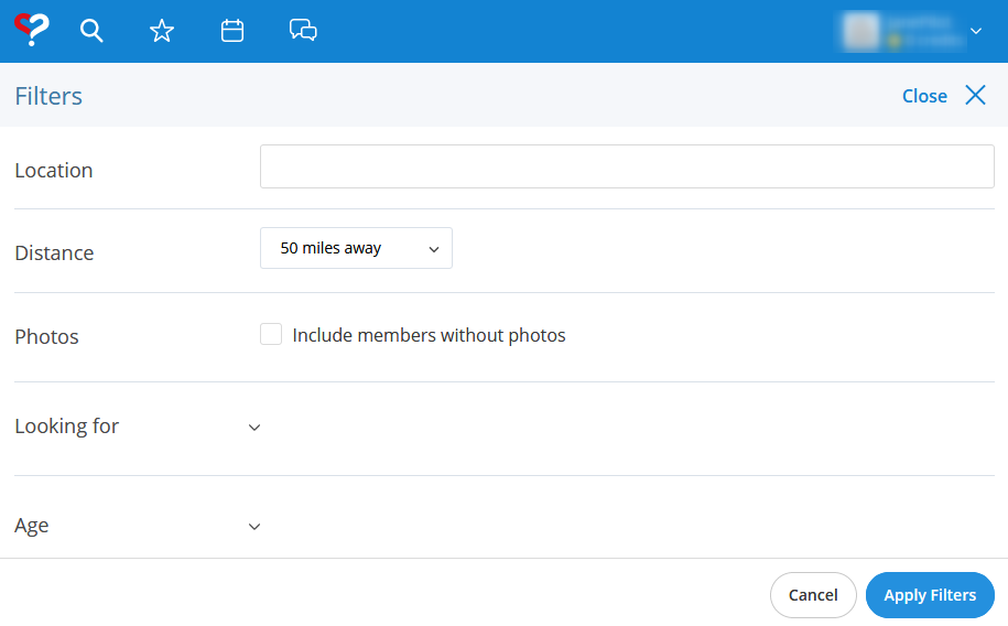
Another good solution has been to hide the filters by default because their range is very extended:
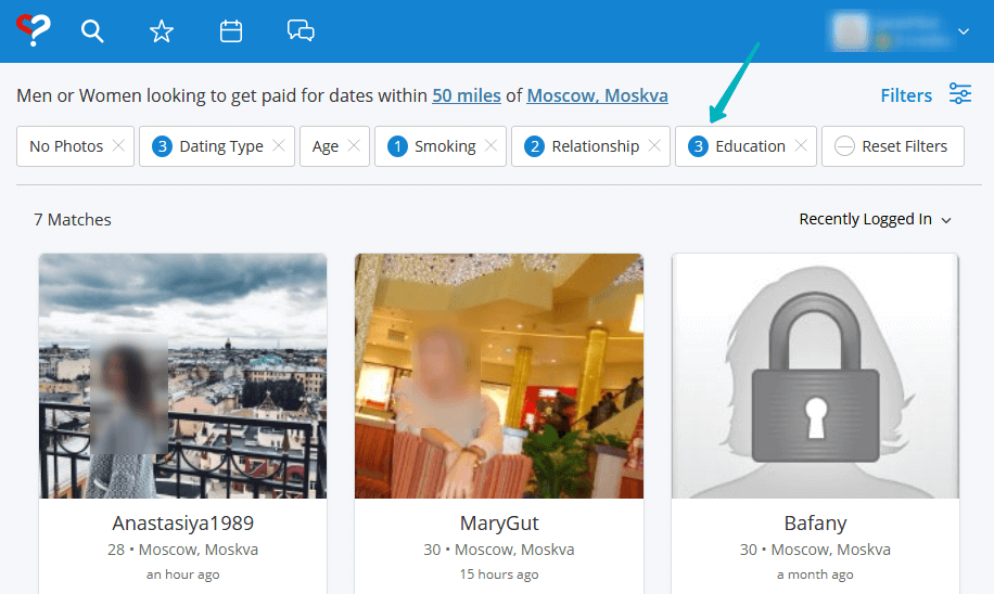
Even after we apply some of the filters, we still see them on the page and can reset them all in one click. It is very convenient:
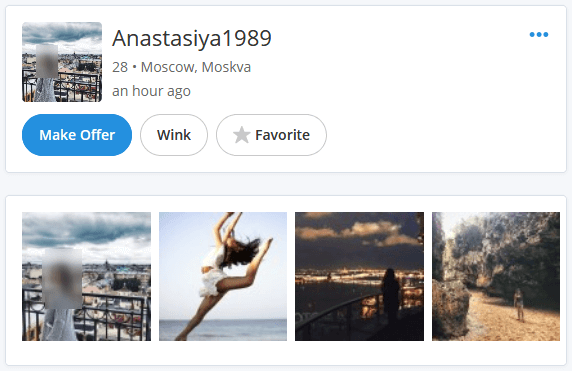
Now we land on a user’s profile page:
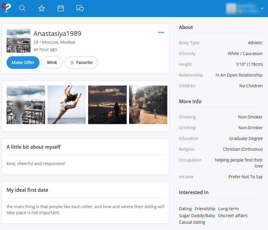
Only 3 activity buttons are offered here; one of them is highlighted to attract the most attention because it represents the main feature of the site — making offers. Well done here.
The photo gallery block is clearly given more priority than the user info block (profile picture and basic user’s info):
The action buttons feel kind of overshadowed. We’d recommend making the top block larger or at least applying more highlight to it.
We now have reviewed the main pages of the WYP website. The site’s design is cool and clean, and it presents a good solution for this particular niche. According to our estimates, developing a similar look and feel based on the Dating Pro platform will start at about $2,000. If you are interested or would like to learn more, please feel free to contact us and leave your comments.
In the next review, we are going to focus our attention on the SEO review of this website, so stay tuned.